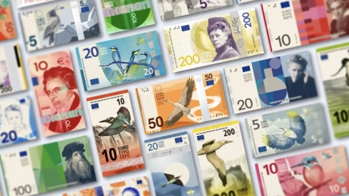
The bridges and windows that have accompanied the euro since its arrival in our pockets are numbered. The European Central Bank has presented the ten finalist series to completely renew the 5, 10, 20, 50, 100 and 200 euro banknotes and has opened a survey to find out which ones are most appealing to citizens.
The consultation will remain available until September 21. Any person residing in Europe will be able to evaluate the designs, point out which elements they like and explain which ones generate doubts. The result will influence the choice, although the final word will correspond to the ECB's Governing Council, which plans to make a decision before the end of 2026.
The candidacies are divided into two main themes. Five revolve around European culture and place Maria Callas, Ludwig van Beethoven, Marie Curie, Miguel de Cervantes, Leonardo da Vinci and Bertha von Suttner on the banknotes. The other five follow the course of European rivers through species such as the kingfisher, the white stork or the Atlantic gannet.
Spain competes twice
Spanish presence stands out in the cultural proposals. Miguel de Cervantes would occupy the 50 euro banknote in any of the five series of this theme, accompanied on the reverse by spaces linked to reading, libraries and cultural exchange.
Spain also appears among the authors. Rubio & del Amo and Cruz más Cruz studios have jointly created design G, a proposal that places faces in the center of the banknote and organizes its visual structure around the letters of the word EURO.
Cruz más Cruz was founded by José María Cruz Novillo and his son Pepe. The designer from Cuenca, who recently passed away, left some of the most recognizable symbols of contemporary Spain, from the logos of Correos and Repsol to the image of the PSOE and numerous works for public institutions.
The Spanish candidacy thus combines a universal cultural reference with its own graphic proposal. Cervantes would share a series with Callas on the five euros, Beethoven on the ten, Curie on the twenty, Leonardo da Vinci on the hundred and the writer and pacifist Bertha von Suttner on the two hundred.
The five designs of European culture
The letters assigned by the ECB identify complete graphic styles. The characters and quantities are the same in the five cultural candidacies, but the way they are portrayed and the organization of colors, symbols, and reverses change radically.
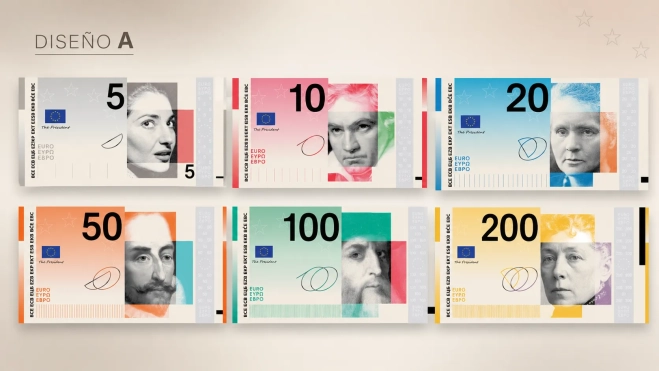
Design A, by Studio Joost Grootens. The proposal crops and enlarges the eyes and mouth of historical figures. The gaze represents observation and thought; the mouth, expression and dialogue. On the other side, people of different ages and backgrounds appear sharing contemporary cultural spaces.
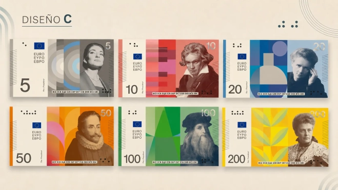
Design C, by Neue Gestaltung GmbH. It is one of the most classic and easy-to-identify options. Each character occupies the center on the usual color of its denomination, while the reverse mixes a map of Europe, constellations and current scenes in theaters, schools, libraries, museums and squares.
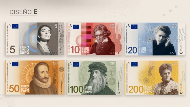
Design E, by Myrsini Vardopoulou. The portraits appear surrounded by circles, signs and references related to the work of each protagonist. The series seeks for the first impact to be simple and recognizable, leaving small details for a more leisurely reading.
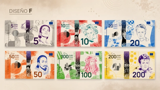
Design F, by Jan Robert Dünnweller. It takes the European motto "United in diversity" to the realm of collage. The faces are hand-drawn and rest on backgrounds formed by textures, cutouts and figures that represent different cultural identities gathered in the same composition.
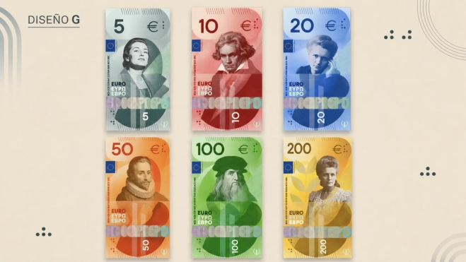
Design G, by Rubio & del Amo and Cruz más Cruz. A direct gaze dominates the center of each banknote. The colors are supported by a common linear pattern and, when the piece is turned, the structure reveals four blocks inspired by the letters E, U, R and O.
Five alternatives between rivers and birds
The second group dispenses with historical figures. Each denomination represents a section of the water's journey, from mountain springs to the ocean, and relates it to a characteristic species of the European landscape.
The five-euro banknote shows a wallcreeper; the ten-euro, a kingfisher; the twenty-euro, a colony of bee-eaters; the fifty-euro, a white stork; the hundred-euro, an avocet; and the two-hundred-euro, a northern gannet. The institutions of the European Union occupy the reverses as a link between the territory, nature, and common political construction.
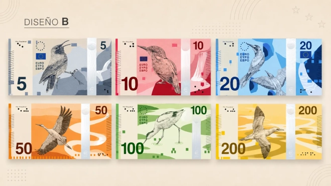
Design B, by PunktFormStrich. This is the candidacy closest to a nature guide. In addition to the bird and its habitat, it incorporates bars that graphically translate its song, a scale of its flight speed, and small facts about each species.
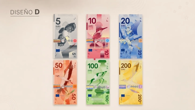
Design D, by Rudy Guedj and François Girard-Meunier. The six birds traverse abstract landscapes united by a continuous river. The light gains intensity as the water advances towards the sea, while the reverse represents the functioning of European institutions through hands that hold, order, and debate.
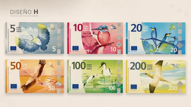
Design H, by Atelier Goppel-Toperngpong. Water serves as a metaphor for the Union. A drop seems small, but the current can transform a landscape; a person has limited capacity, but millions of citizens can drive a common construction. The result is a clean series with strong symbolic content.
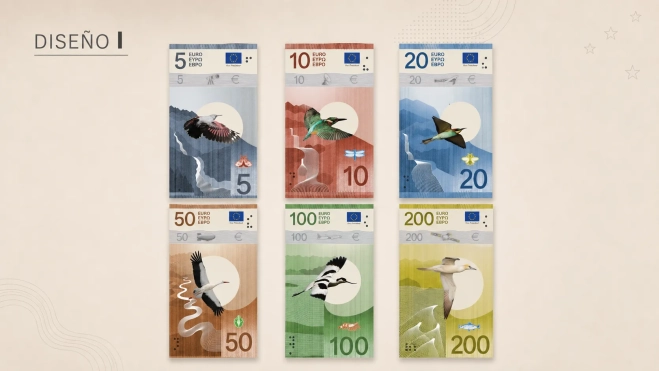
Design I, by Isabelle Daëron. Movement guides the entire proposal. The flight of birds and the course of rivers are drawn through a combination of handmade strokes and digital patterns, with solitary specimens on the obverse and groups on the reverse.
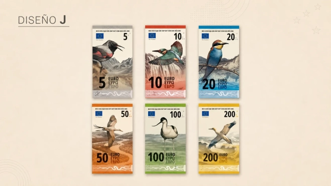
Design J, by Ville Tietäväinen. This is the option with the clearest narrative from beginning to end. Small values start in the mountains and higher denominations progressively approach the ocean. Holograms would also show each stage of the river and the corresponding bird.
How to participate in the survey
The ECB asks participants to rate the ten proposals separately. The survey allows selecting preferred designs, examining their obverses and reverses, and commenting on aspects such as ease of recognizing the value, attractiveness of colors, or clarity of the message.
The open internet consultation will be complemented by another study commissioned to an independent polling firm, which will survey a representative sample of euro area residents. The institution will publish the results once the definitive concept has been chosen.
More than 1,200 designers from across the European Union applied to participate in the competition. Twenty-five were invited to develop a complete series, and an independent jury of 21 specialists in design, history, communication, and neuroscience selected the ten finalists.
The winner will not immediately reach ATMs
The decision expected by the end of the year will mark the beginning of another phase. The winning proposal will have to undergo technical tests, printing adjustments, and controls to ensure that each value can be quickly recognized and that the images work on millions of banknotes.
The new euros will incorporate enhanced anti-counterfeiting measures, clearer tactile elements for visually impaired people, and manufacturing processes with a lower environmental impact. The ECB will retain the colors associated with each denomination to facilitate the transition.
The renovation also sends a message about the continuity of cash at a time of expansion of Bizum, card payments, and the digital euro project. The Eurosystem wants to keep banknotes as an accessible, secure, and available means of payment for those who prefer to continue using them.
The chosen designs will take several years to reach wallets. When they do, current banknotes will retain their value and circulate alongside the new series, while central banks progressively withdraw deteriorated specimens.
The survey will remain open until September 21. Afterwards, its results will be incorporated into the jury's assessment and the technical examination before the ECB's Governing Council chooses which of proposals A, B, C, D, E, F, G, H, I, or J will represent the euro for the coming decades.
Add ElConstitucional.es as a preferred Google source for free.
Stay informed about all the latest breaking news with the best information. Against disinformation, for democracy and social rights.
