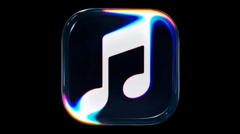
Apple has found a way to give context to one of its most commented aesthetic changes in recent days. The company has published a video showing the creative process behind the new Apple Music visual identity, whose black and white icon has generated criticism among some users. Instead of resorting to conventional digital animation, the brand has opted for a physical experiment in which sound transforms the movement of a liquid and shapes its new symbol.
The initiative, dubbed "Made by Sound", turns the redesign into more than just a makeover. Apple wants to explain where its new identity comes from and assert the value of artistic experimentation at a time when artificial intelligence is transforming creative processes. The result connects with the aesthetic of transparencies and reflections associated with Liquid Glass, the visual language that the company has incorporated into its operating systems.
Go behind the scenes of Made by Sound.
— Apple Music (@AppleMusic) October 21, 2026
A story of music, collaboration and craft with @fredagainagain1 and NEST Acoustics. Discover how sound brought the Apple Music logo to life, captured entirely in camera. Just music, made visible. pic.twitter.com/ZyMRGdUVUX
How Apple created the new Apple Music logo
The video shows a montage built around a glass container with mineral oil. A transparent piece in the shape of the application icon is placed on top of it. When a musical composition designed for the project begins to play, the vibrations cause movements in the liquid and generate visual forms that are captured directly with a camera.
The procedure turns sound waves into part of the creative process. Instead of digitally recreating reflections, distortions, and transparencies, the team works with real materials to achieve the desired effect. The proposal features the collaboration of British producer Fred again.., responsible for the musical sequence, and NEST Acoustics, which participates in the development of the sound installation.
The audiovisual piece allows observing how an image is constructed from physical elements, from the preparation of the montage to the final result. It is a way of bringing to the public a part of the work that normally remains outside the visual identity of a brand: the tests, the materials, and the creative decisions behind an apparently simple symbol.
The rebranding that didn't convince everyone
The presentation of the new icon was not without controversy. The black and white version moves away from the colorful image that has historically accompanied Apple Music and has sparked critical comments on social media. The modification has been linked to the beta versions of iOS 27.2, although user reaction does not necessarily imply that Apple will modify the design before its definitive launch.
The video now provides a conceptual explanation for the change. The company presents the logo as a visual representation of sound and not just as a graphic resource to distinguish its application on the iPhone screen. The new identity is also accompanied by a proprietary typeface and a renewal of the brand image on Apple Music's digital channels.
The difference between the icon and the video is also striking: while the audiovisual piece experiments with reflections and colors, the application version opts for a much more sober composition. For now, it has not been confirmed whether the final design will incorporate chromatic variations.
Apple champions artisanal creativity amid AI expansion
The campaign fits into a creative line that Apple has already explored in other audiovisual projects. The company has previously shown production processes based on physical effects and real recordings to build advertising pieces, instead of relying exclusively on computer-generated images.
On this occasion, the choice of materials such as glass and oil also establishes a visual connection with Liquid Glass, the aesthetic of translucent surfaces and reflections that characterizes the company's most recent interfaces. The difference is that the effect is not limited to being reproduced on a screen: it is obtained through a tangible assembly that responds to the vibrations of the music.
The message comes at a time when artificial intelligence tools allow generating images, videos and compositions with increasing speed. Apple proposes another way here: using technology without giving up manual work, experimentation and the direct intervention of creative professionals. The new icon may be liked more or less, but the company has decided to defend it by showing how it was conceived.